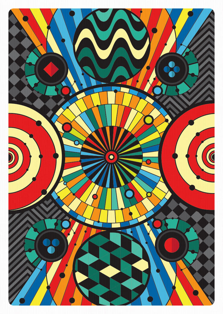
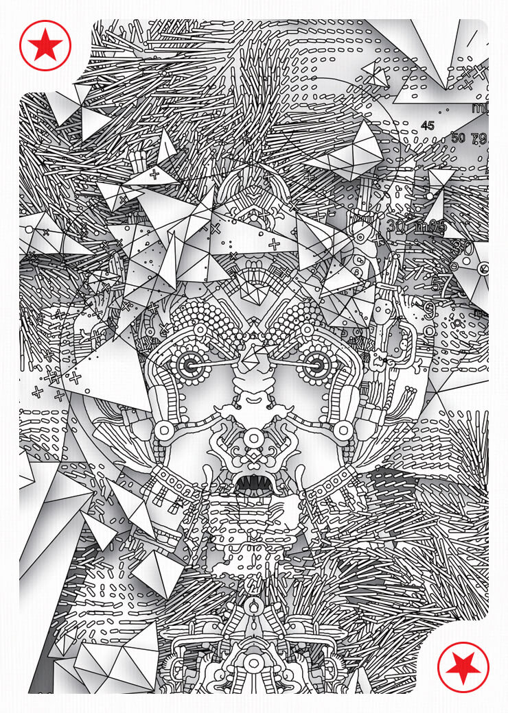
Edition One
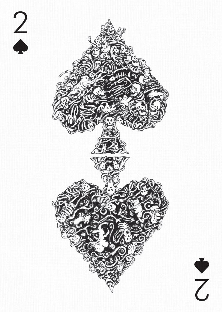
Mattias Adolfsson
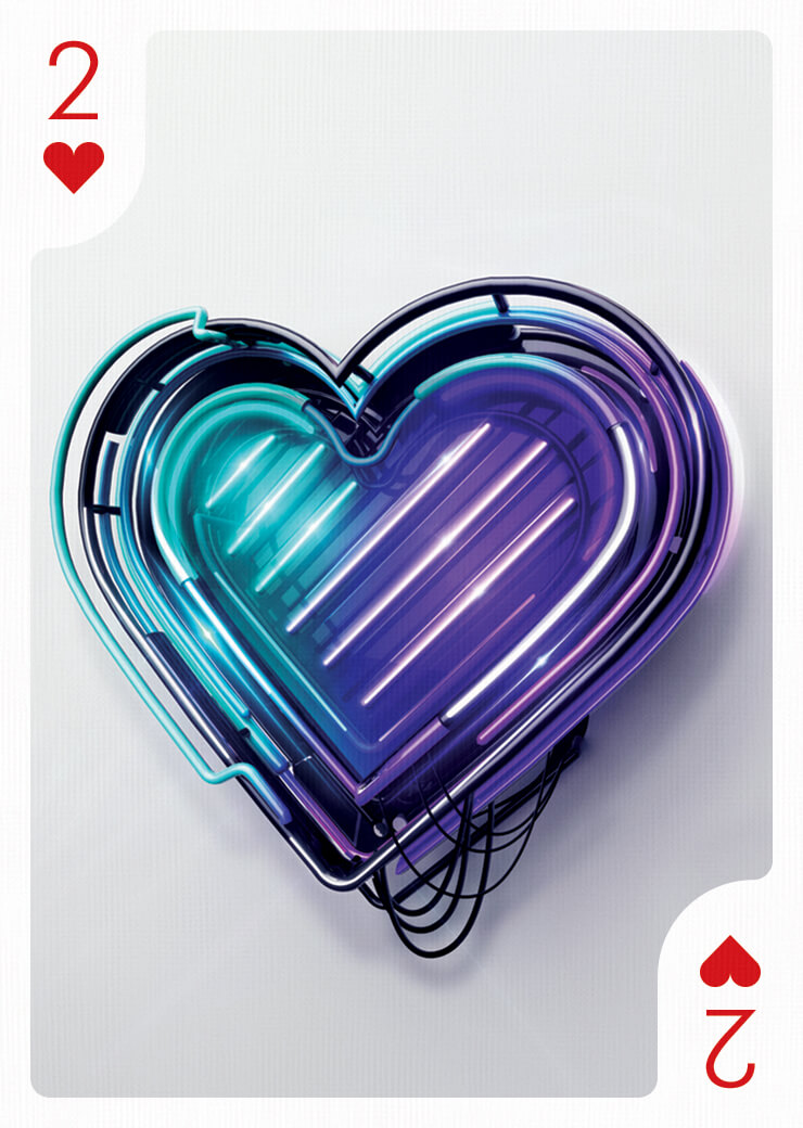
Peter Tarka
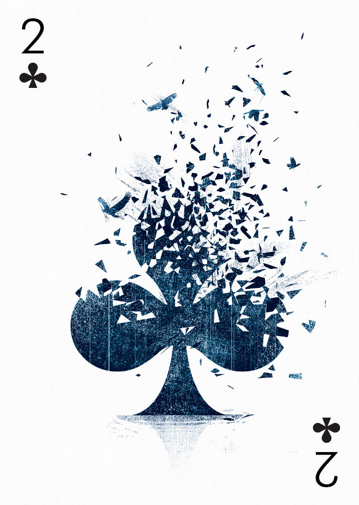
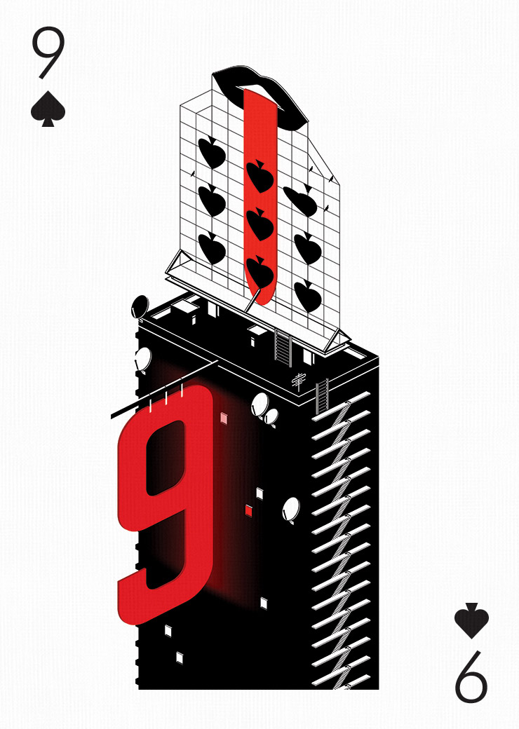
Tang Yau Hoong
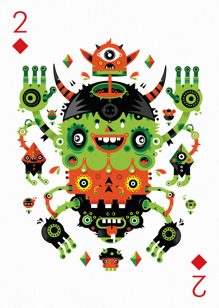
Yema Yema
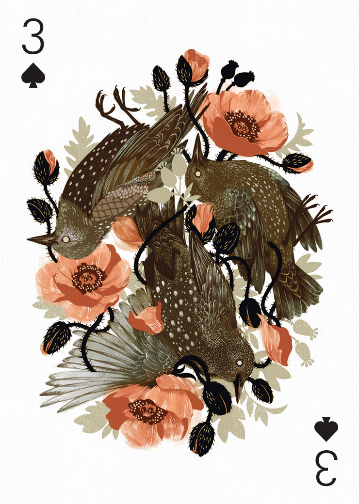
Teagan White
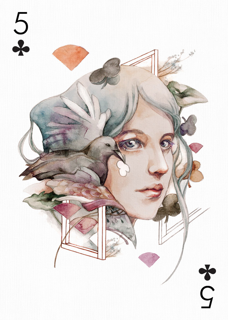
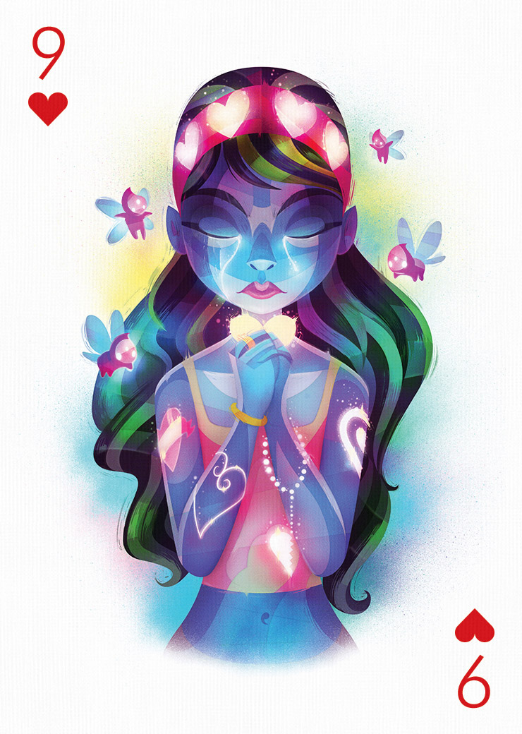
Mercedes deBellard
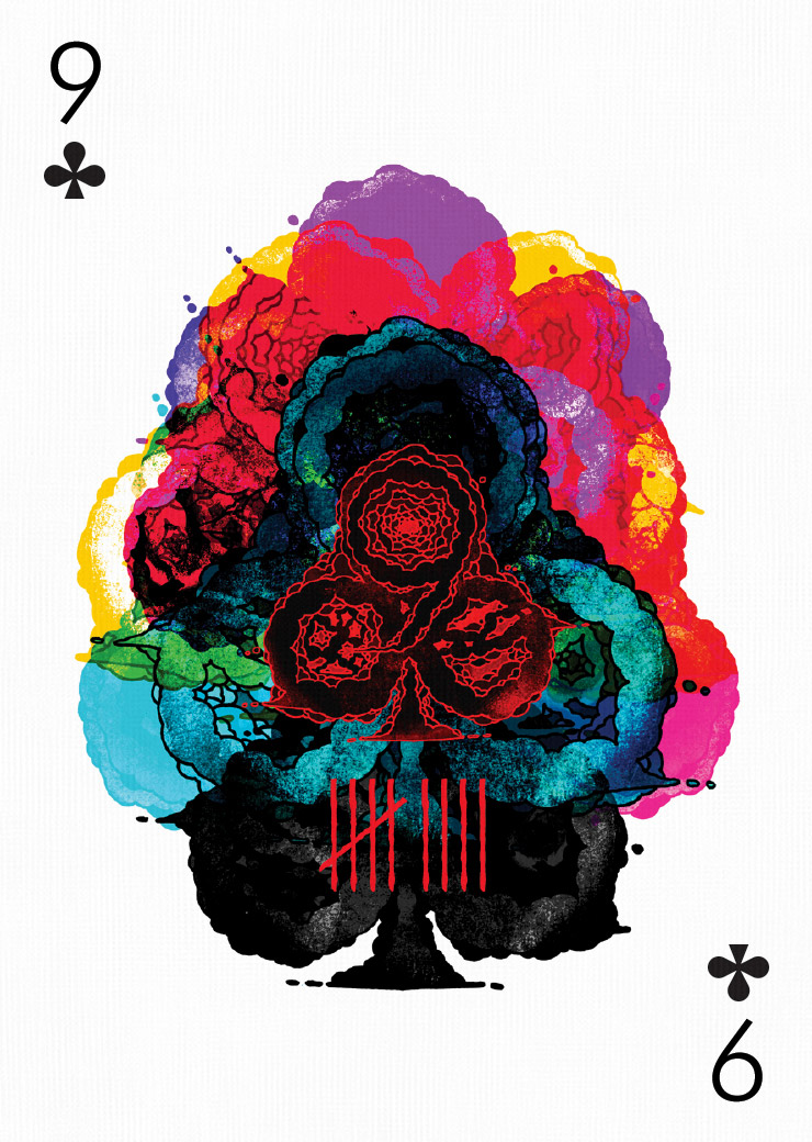
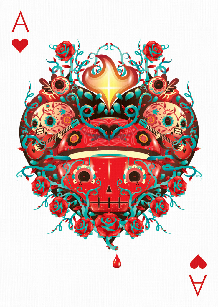
Fernando Chamarelli
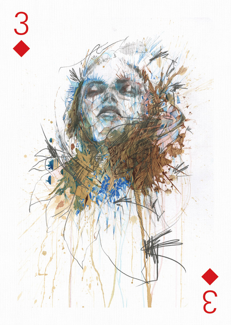
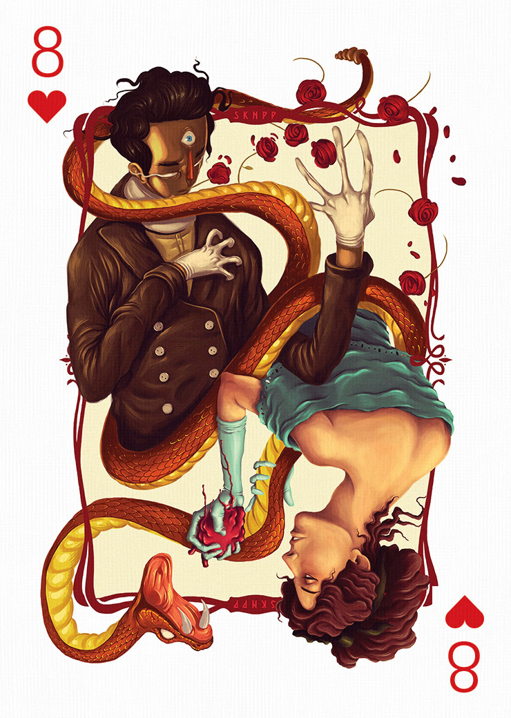
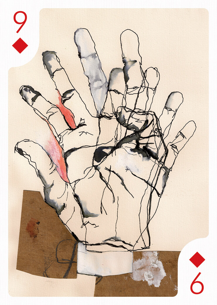
Carne Griffiths
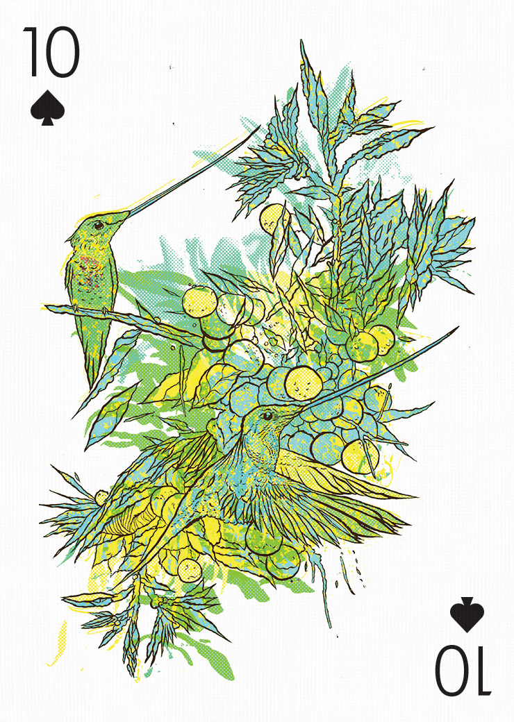
Serial Cut™
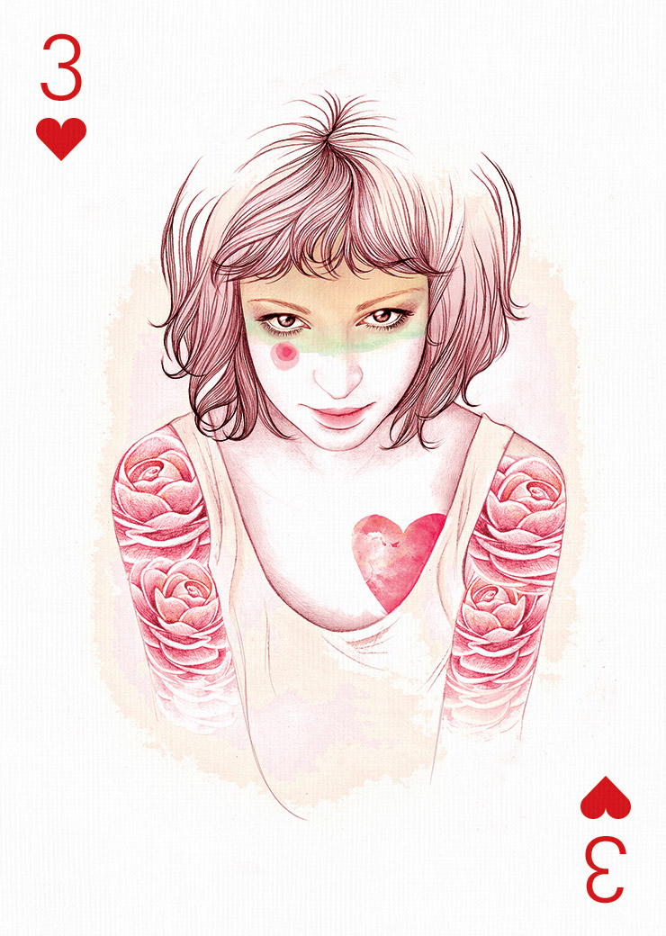
Ruben Ireland
MUTI
Peter Olschinsky
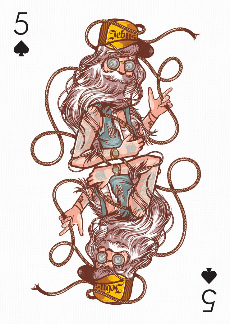
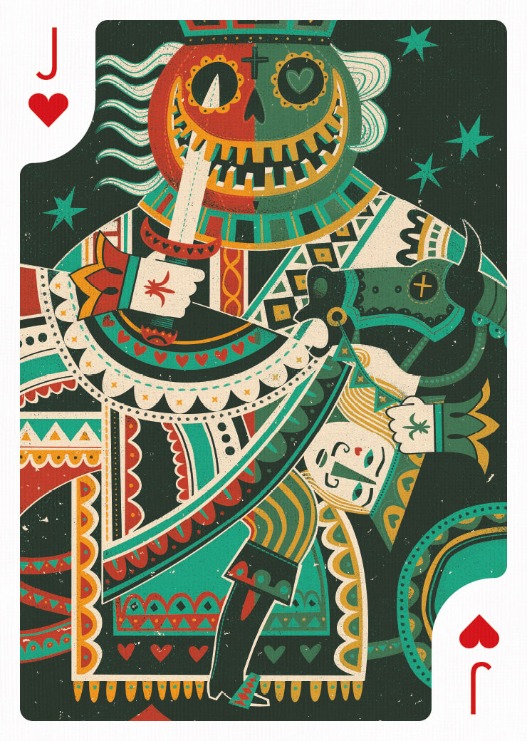
Musketon
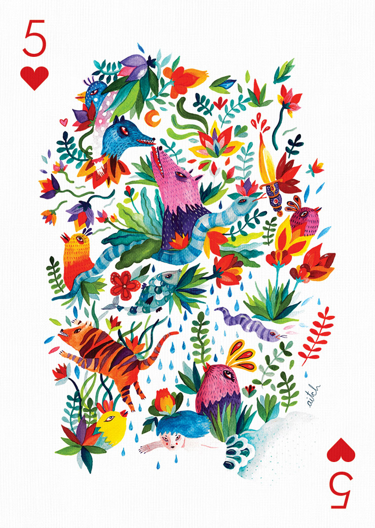
Aitch
Valerie Ann Chua
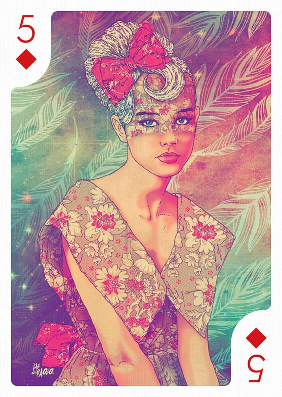
Fab Ciraolo
Fernando Volken Togni
Javier Medellin Puyou
Tobias van Schneider
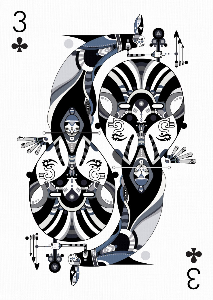
VASAVA
Muxxi
Felix LaFlamme
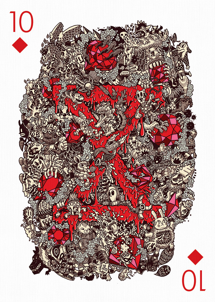
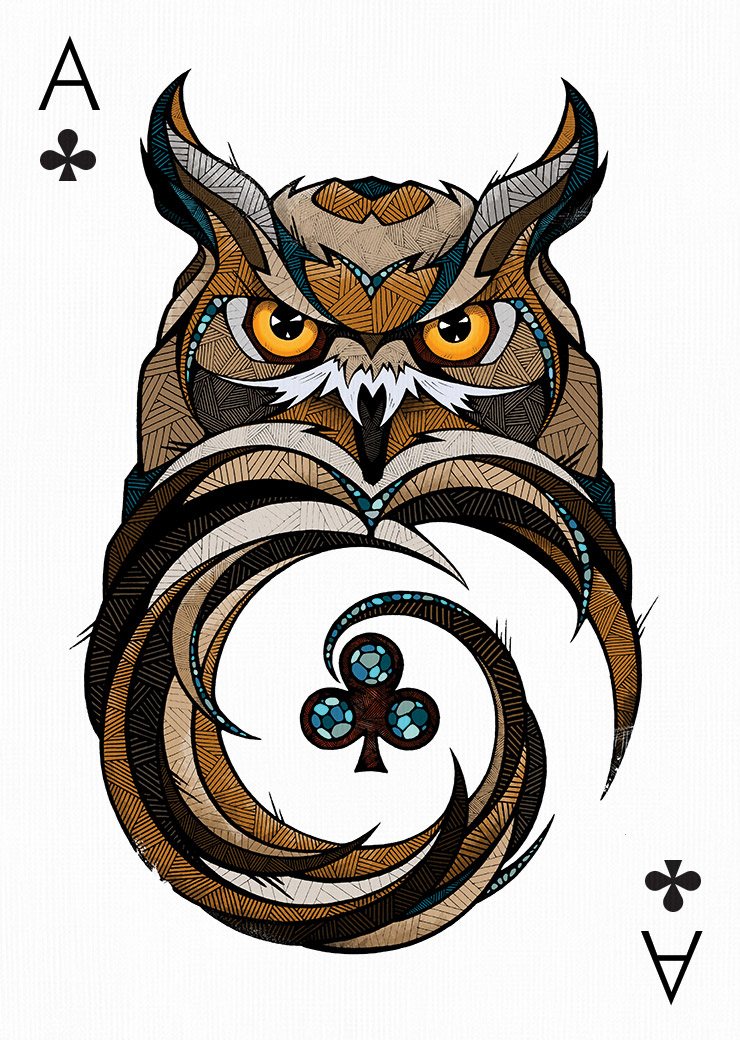
Krzysztof CHKN Nowak

Matt W. Moore
Gary Fernández
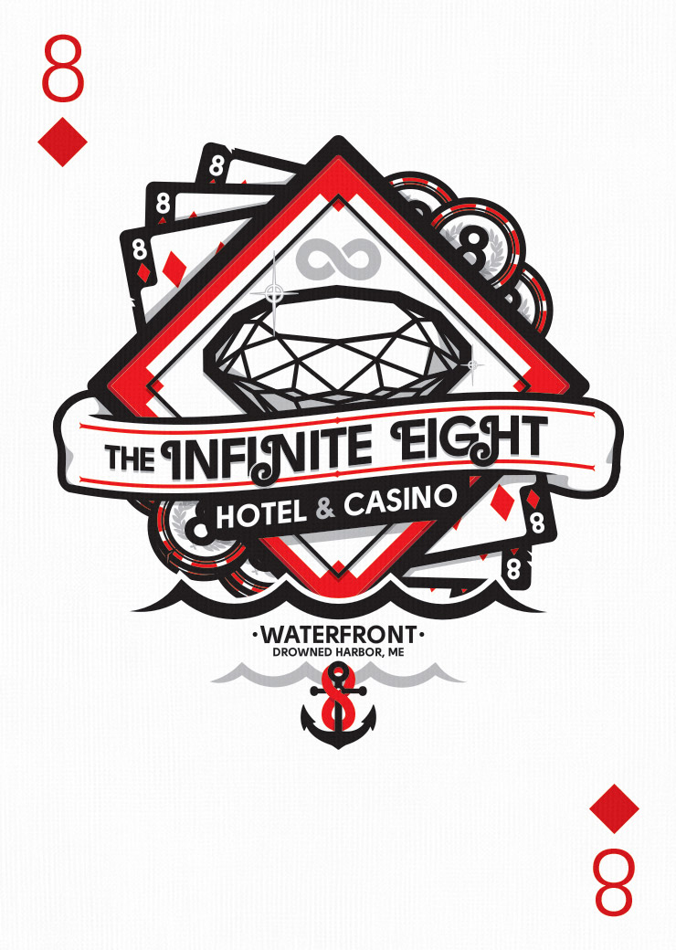
Raul Urias
El Grand Chamaco
Jthree Concepts
Anton Repponen
Carlos Lerma
Chuck Anderson
Pirecco
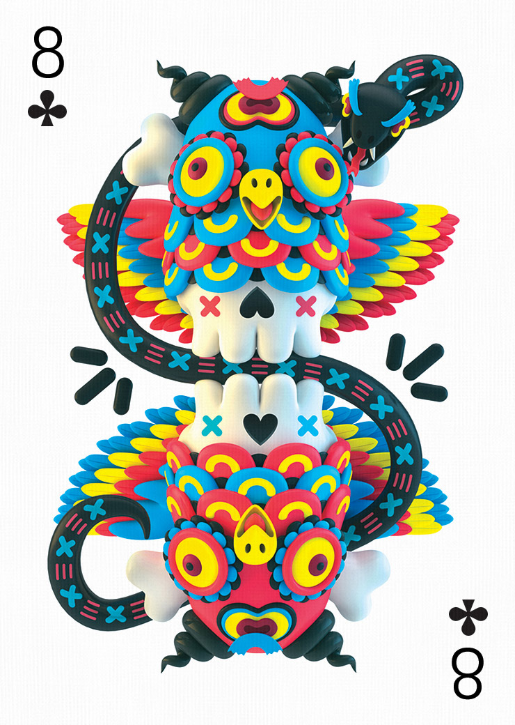
Bicicleta Sem Freio
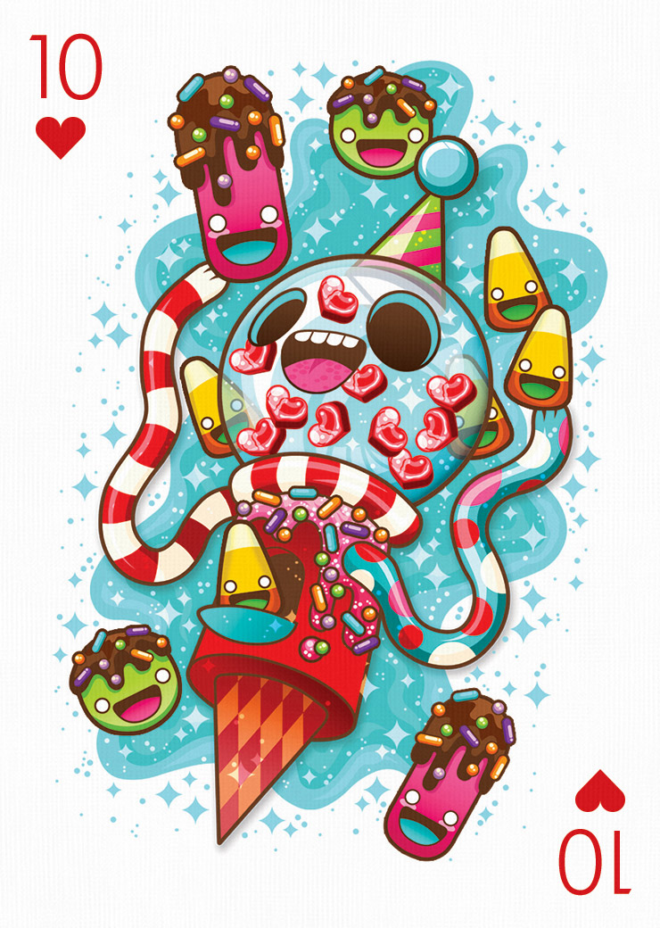
Caramelaw
Hey
Lei Melendres
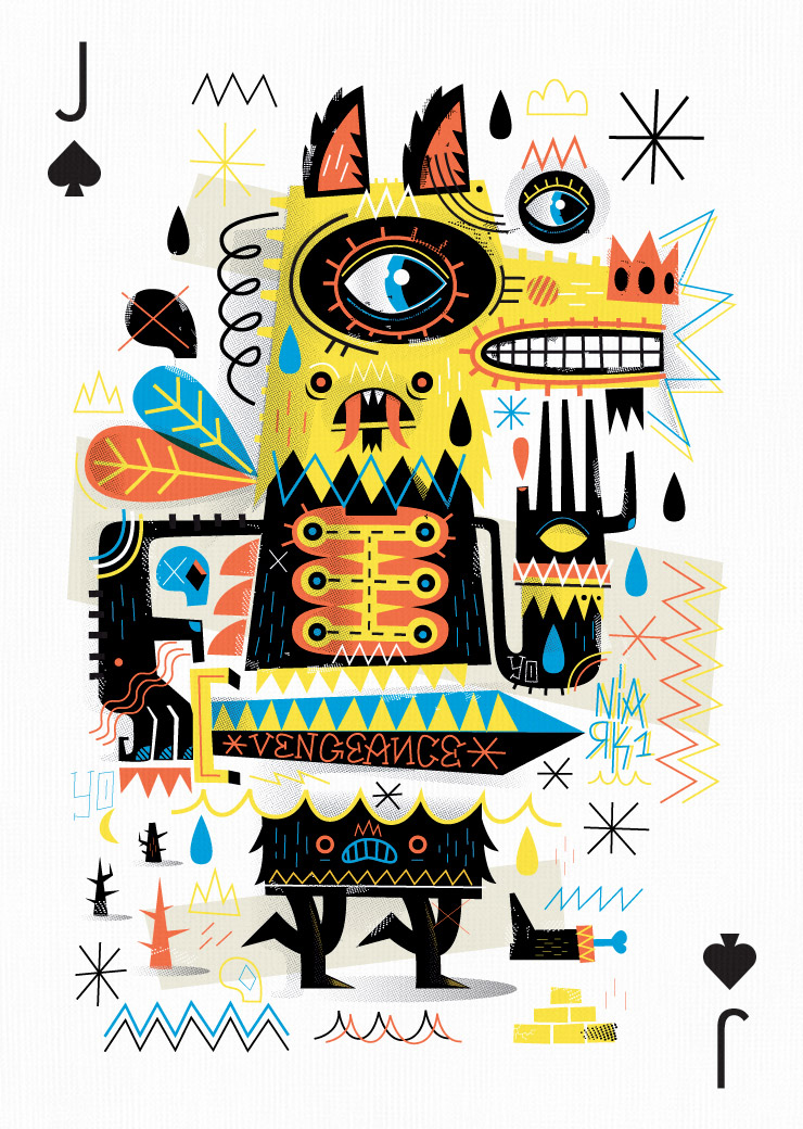
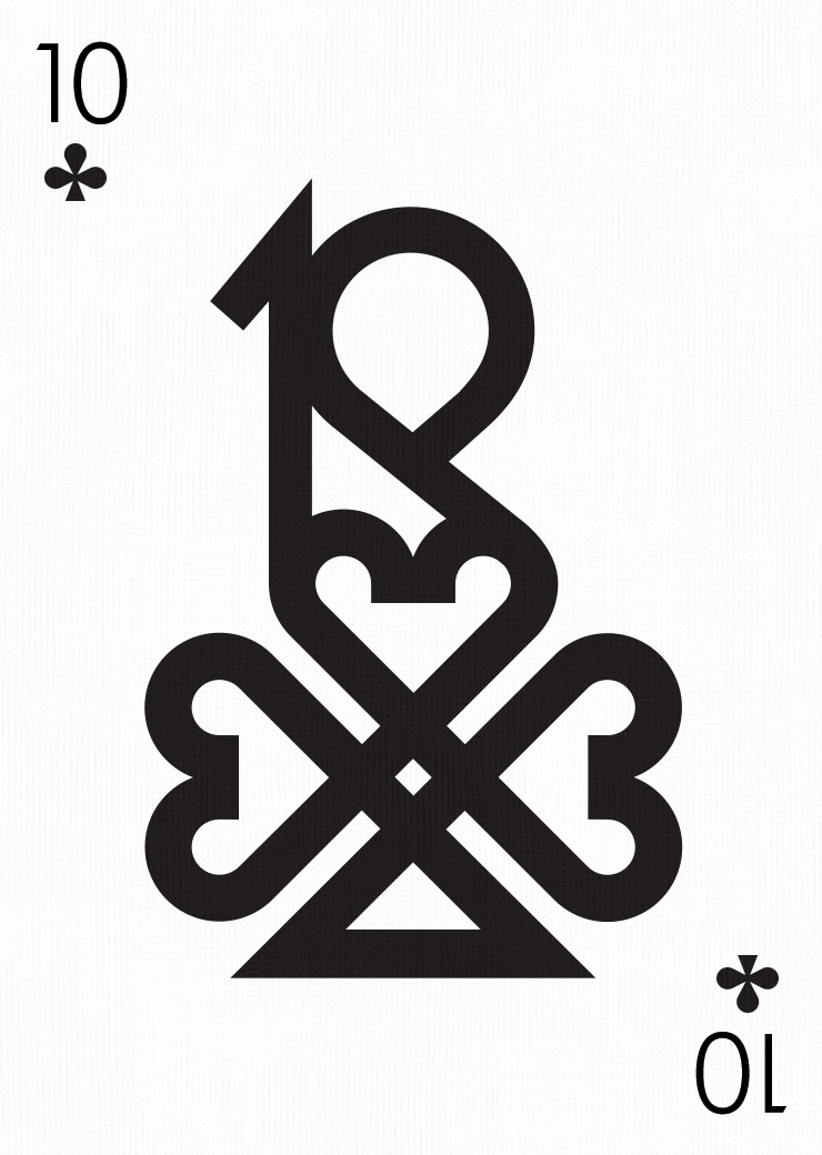
Seb Niark1
Steve Simpson
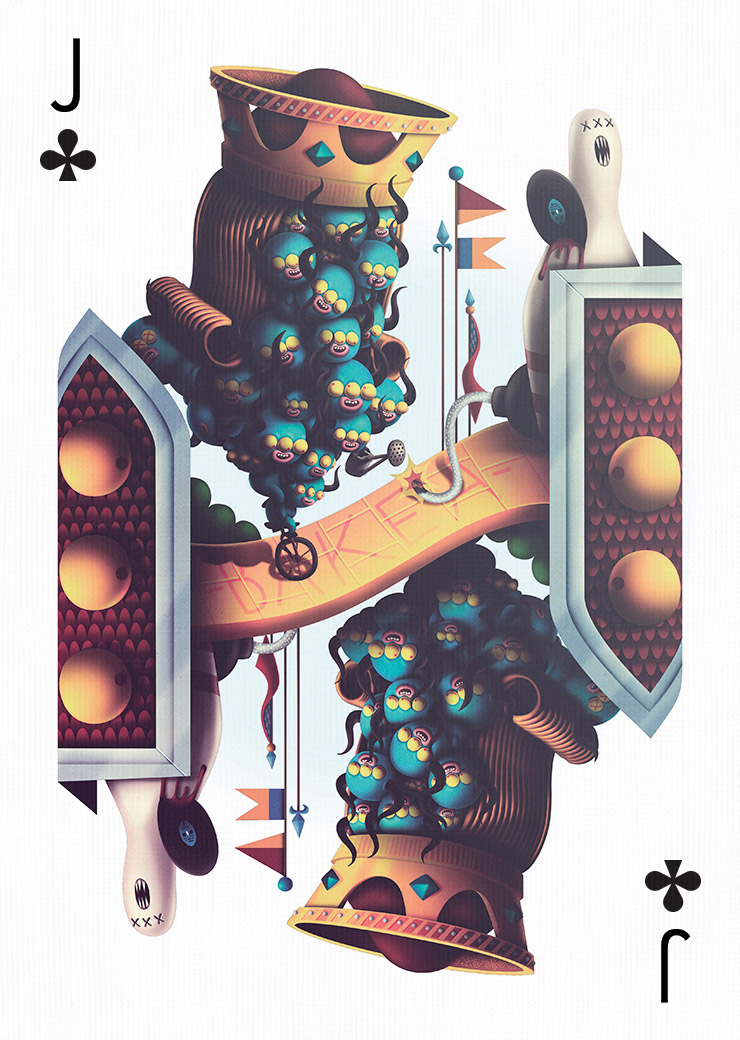
Bakea
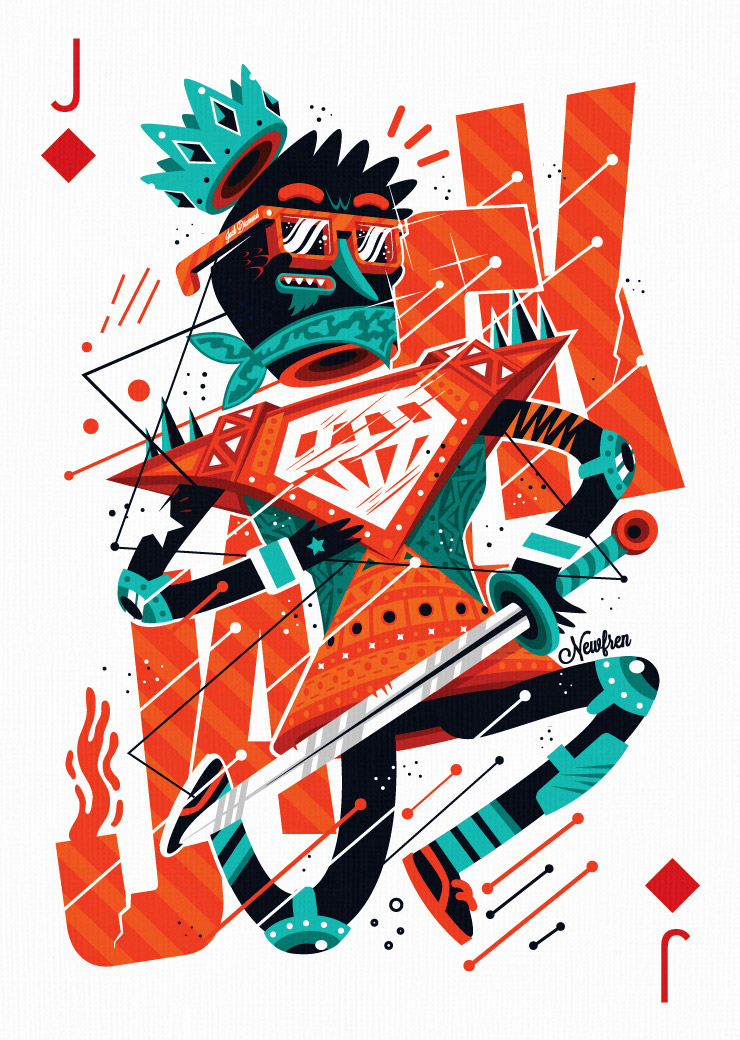
Newfren
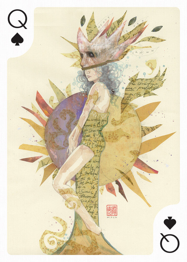
David Mack
Conrad Roset
Ise Ananphada
agnes-cecile
Yulia Brodskaya
Sara Blake
James White
Saturno (THE CREATTER)
Iain Macarthur
Mr. Kone
Andreas Preis
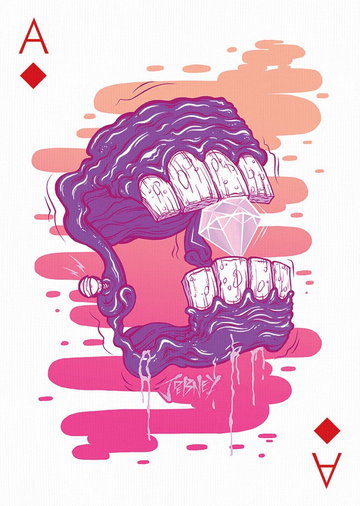
Jordan Debney
Mike Friedrich
Evgeny Kiselev
Joshua Davis
Physical Deck
size
Poker, 88.9 × 63.5mm
material
Bicycle® paper with Air-cushion finish
inside
52 Playing cards + 2 Jokers + Info card


© 2012—2024 Digital Abstracts SL. Any artwork displayed on this website may not be reproduced or used in any manner whatsoever without the express written permission of Digital Abstracts or their respective owners. Patent Pending. We use cookies and similar technologies for statistics and marketing purposes. Privacy Statement